Thank you for wanting to be a part of the Australian Science Communicators National Conference 2014. We’re looking forward to seeing you and your poster in Brisbane so don’t forget to register! If you haven’t done so already, head to this link and register as soon as you can.
Tell us you’re poster-keen first!
To sign up, login to your presenters account (or create one if you haven’t already) via this link and express your interest by Tuesday December 17th.
Here’s some information, guidelines and tips to have a look at before you get on with creating your poster:
Setup
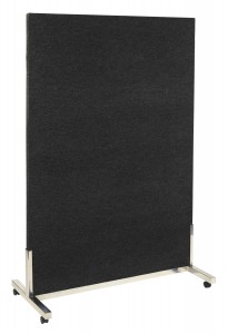
- Posters will be mounted on large display boards like this one.
- Each poster will be assigned a specific board. Simply find the board with your name on it during setup.
- Velcro will be provided for adhering your poster to the board. If you can’t find them, just ask one our helpful conference volunteers working in the area on the day of setup.
- The poster exhibition space will be accessible from 10am on Sunday the 2nd of February and your poster should be in place by no later than 2pm on this day. If you have any problems in this regard please contact Pete Wheeler via asc.treasurer2012@gmail.com
Poster Session
- Several programs are planned for the evening of Monday the 3rd of February. Between 6:15pm and 7:15pm poster presenters are asked to stand alongside their posters and interact with delegates.
- During this time judges will assess each poster.
- Posters will remain on display throughout the conference and should be taken down between 1700 and 1800 on Wednesday 5 February 2014.
Guidelines
- Posters must be no greater than A0 size (84.1cm wide and 118.9cm high).
- The display board your poster will be mounted on will be a vertical panel measuring 1.8m high and 1.2m wide. For this reason we would encourage a portrait orientation but a landscape orientation could be accommodated (just) if this is preferred.
- Authors are asked to have A4 paper versions of their poster available as handouts.
- Wireless internet connection will be available (thanks to our sponsor CSIRO) if you wish to use a tablet device to further communicate your work.
What to bring
- Your poster.
- Business cards.
- Handouts. We recommend that you bring a one-page handout about your work, with information on how to learn more, to distribute to those interested in what you are doing. It should include your contact information (including email address) so that your colleagues may follow-up after the conference if needed. Please bring at least 50 copies.
Poster Composition
- Posters should be visually appealing.
- Ensure your poster is carefully presented and that text is large and clear enough for the poster to be read from at least two metres away. The smallest type should be an absolute minimum of 24 pt with headings in 48 point or larger. Narrative text should be in a serif font (like Times New Roman, Baskerville, etc.). Headings, titles, graph labels and so forth can be in a sans serif font (like Verdana, Trebuchet, or something even more interesting). Also consider breaking up large paragraphs into smaller chunks, which are more approachable.
- Incorporate contact details such as your name, organisation, job title, contact phone number and email address. You may want to add your mobile phone number so delegates can arrange to meet you at your poster at specific times.
Design Tips
- If you’re not sure if your elements are readable, pin one to a wall and back away three strides. Can you read the headlines and subheadings enough to be drawn in to read more?
- Make it to the point with elements that highlight your work. You have a brief period of time to catch attendees’ attention. Emphasise the most important components of your work in a clear and visually appealing way. Those who share your interests will stop and learn more from you directly or from your handouts.
- Steer clear of jargon as much as possible. A common frustration with conference posters, in particular for new and international attendees, is the use of ‘insider’ language, acronyms, and abbreviations that make it difficult to comprehend the information being presented.
- Try and organise the information logically into sections, with text and graphics that flow from one part to the next. One way to maintain organisation is to leave plenty of empty space between sections.
- Keep the poster uncluttered. Your poster should strike a balance between including sufficient information about the topic and not being cluttered. Using graphics whenever possible will help.
- Make it visually engaging, in that a passerby would be attracted to the poster by use of large, clear graphs or diagrams, photographs, or other images directly related to your work. Use your own photos or locate some online at professional stock photo sites. Even in the absence of pictures, data visualisation and colour blocks behind key text are two simple ways to increase visual engagement.
- Remember that your computer screen only requires images to have a resolution of 72 dpi (dots per inch) to display correctly. Anything printed requires a much higher resolution, ideally 300 dpi but you can get away with 220 dpi on occasion. So, make sure you are using the highest resolution graphics you can.
Ready to print?
You’ll need to head to a business that can handle large printing on a single sheet of paper. If you have any further queries, please contact Pete Wheeler on 0423 98 2018 or by email at asc.treasurer2012@gmail.com

